We’ve written articles about how to fix business website problems with content marketing and SEO. But what if your issue stems from your site’s design? Bad user experience can seriously hurt your business. Let’s talk about common web design mistakes – and how to fix them.
To go straight to our recommended user experience fixes, jump to the last section of this post.
- Website navigation mistakes
- Too many menus or menu options
- Unclear path to important information
- No suggested next steps
- 404 page is a dead-end
- Links leave your website behind
- Website content mistakes
- Unclear purpose
- Indirect language on navigation options
- Off-brand or grammatically weak messaging
- Poor visual content
- It’s all about you
- Website design mistakes
- Not mobile-friendly
- Too slow
- Not secure
- Information overload
- Overly minimalist
- How to fix common web design mistakes
- Isolate navigation issues
- Restructure your content
- Catch copy issues
- Optimize your images
- Do A/B testing
- Plan a redesign
Website navigation mistakes
Website navigation is about creating logical paths to information, displayed at optimal times in the user’s journey. If your website has major issues within its navigation, no one will find your content. No content discovery means no conversions!
Too many menus or menu options
Studies have shown that when given too many options, the human brain can get so anxious that it won’t pick anything. You don’t want to create that situation with your website’s menus.
If your site has menus on multiple sides of the page or too many drop-down options under each heading on the main menu, a visitor’s eyes can quickly glaze over. The likelihood of them finding the information they need to convert is slim to none.
Unclear path to important information
In the same way that too many options are a problem, not being able to find an option is a conversion killer.
Most Internet users are accustomed to a common standard of how and where they’ll find information on a business website. Placing content in abnormal locations creates unnecessary confusion, which can cause visitors to give up and move on to your competitors’ sites.
No suggested next steps
One of the biggest web design mistakes we see among small businesses is a lack of lateral navigation. No related content, no features, no gentle nudges closer to conversion.
If you let the reader get to the end of a post or project and don’t offer the next step, you’re ending their journey on your site – and creating a window to exit.
404 page is a dead-end
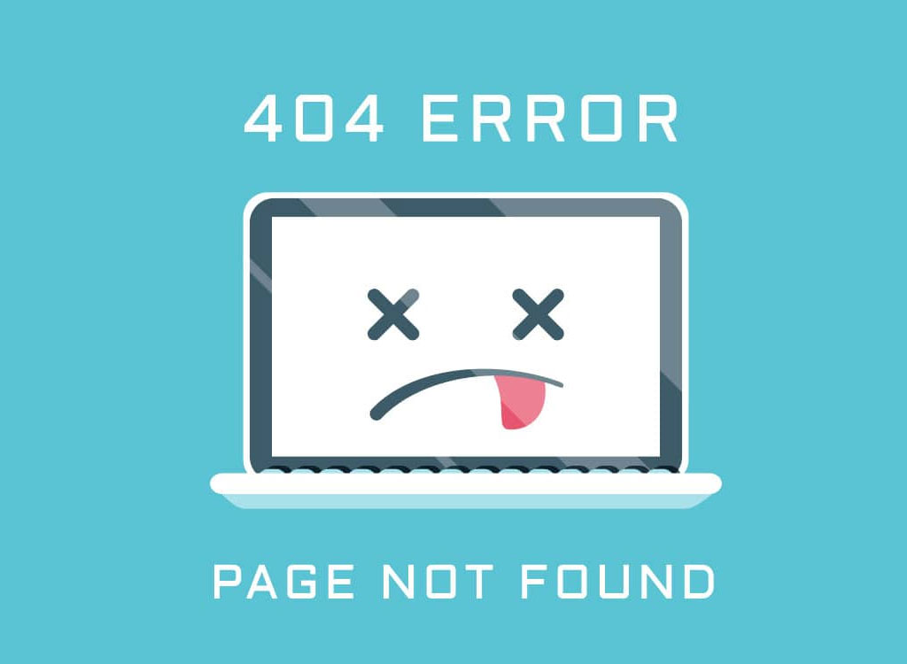
The 404 page is what your visitor sees if they make a typo in the URL, or click a link to a page that no longer exists. Check your website’s error log to see how often this happens to your audience.
If your 404 page offers nothing more than an apology and the ‘back’ button, or a simple link to your homepage, you’re missing an opportunity. A thoughtful 404 page can delight, entertain, inform, and help a visitor find something else to satisfy their search. It should create a bridge back to key areas of your website – not a dead end.
Links leave your website behind
When a visitor exits your website, the chances of conversion plummet. Does your site have links within copy or the design that open in the same browser tab? You’re voluntarily replacing your own site with someone else’s.
Always set links within page or post copy to ‘open in a new tab’. The same should apply to any other linked content on your website, including your social media icons or CTA buttons to third-party payment pages. Don’t rely on your visitors to use that back button!
Fix your website’s wayfinding right now! Check out Website Navigation Best Practices.
Website content mistakes
Plenty of websites have straightforward user flows, but are still seeing an abnormally high bounce rate (you can fix that!) or poor conversion rate. Take an honest look at your content to see if your creative elements are delivering the bad user experience.
Unclear purpose
When someone visits your website, can they immediately understand who you are and what services or capabilities you provide? These are web design mistakes that happen too often:
-
- Visible copy uses jargon, unclear wording, buzzwords
- The copy describes a vague outcome rather than a specific offering
- Most of the screen is filled with a video or banner, no descriptive copy visible without scrolling
Your organic search visitors have hundreds of thousands of other options within a single click. Remember that fact when planning your page layouts.
Indirect language on navigation options
It can be mighty tempting to go for quirky, cute wording on your CTA buttons or menu items. But if most of your audience doesn’t get it, they’ll never see that content.
Some companies do find success using clever phrasing on their CTA buttons – it depends as much on the text as it does on the audience and industry. Surrounding images and the copy can also influence whether the intent is understood or not. Research and testing can help you decide if it’s worth the gamble.
Off-brand or grammatically weak messaging
Is your website’s copywritten as if speaking directly to your target customer? There are several messaging mistakes that we see all the time related to targeting:
-
- Overly technical copy
- ‘Stuffy’ copy that doesn’t sound human
- Outdated or confusing references
- The inconsistent voice between different website pages and posts
- Inconsistency between ads, social media, emails, support chatbots, and website
- Multiple grammatical errors
Your site represents your business in the same manner as a sales or customer service rep. If it doesn’t resonate with a visitor, they won’t stick around.
Poor visual content
Outdated styling, cheesy stock photography, low-quality images or videos, and illegible or mismatched typography are huge barriers to keeping visitors on your site.
We frequently redesign websites for trades and industrial companies with heavily outdated content. They have exceptional reputations built on decades of experience, but customers and other industry professionals have complained that their sites are confusing, missing services, or feel unprofessional due to aged images and typography.
Your website needs to be visually appealing, readable, and to evoke a sense of trust and leadership.
This site is such a gem of bad design, stock photos, and typography that I can’t resist using another screenshot:
It’s all about you
Is your homepage filled with humble brags about your greatness? You might be the best in the industry, but no one will listen if your content reads like a pushy salesman.
Your website’s purpose is to help visitors understand how you can solve their problems. In order to communicate that, you need to make it about them – use language they would use, acknowledge their pain points, and show proof of how you’ve helped others with the same need.
Website design mistakes
Sometimes the problem with your user experience comes down to the page design, structure, or even how you have it hosted.
Not mobile-friendly
Another big web design mistake, if not the biggest, is a poor mobile experience. If the images and copy aren’t scaled to mobile screens, if menu options are too small to tap, and if the site doesn’t load quickly – say goodbye to your visitors.
Mobile accessibility is important for both your SEO and your user experience, and there’s no excuse to have a non-responsive website!
Too slow
With so many site speed tools, like Google’s Page Speed Insights, there’s no excuse to have a slow-loading website. Google favors speedy sites that deliver a great mobile experience, and people expect that experience from every site they visit.
Sometimes this is an issue with the server where your site is hosted, and you may need to run updates or get technical support. It could also be that you have giant images or video content that slows down the page load. Issues within your site’s code can also impact speed. Whatever the reason, a slow site comes across as unprofessional and costs you, visitors.
Not secure
If your site isn’t securely hosted – if its page URLs start with HTTP rather than https – this sends out warning signals that you don’t want anyone to receive (especially if you’re any kind of security company!).
Google favors secure sites, so right away you are missing out on an SEO ranking signal. Google Chrome and other browsers also warn people if they are about to visit a non-secure site. If your audience cares about their privacy and data (and who doesn’t?), this warning combined with the plethora of other search results can drive them away.
Site security extends beyond your hosting and includes all of the pieces that make up your website. Learn all about how to protect your WordPress website in this great article from Best VPN.
Information overload
When visitors land on your site, are they slammed with walls of text? Is every page full of chunky paragraphs and few or no images?
Designing for the web is about creating easily digested content. That means short paragraphs, scannable styling, plenty of visual content areas and white space, and concise information delivery. The goal for most B2B sites is to get the visitor to contact you; many of those extra details can wait for the next step in the buyer’s journey – or live on supporting content pages that a reader can opt to view.
Overly minimalist
On the polar opposite side of web design mistakes, your site might be an information void. An overly minimalist landing page design with only one word and a menu, or a few vague words that are meant to be mysterious and intriguing, can hurt your business.
It’s tempting to try out a trendy or unique web design to showcase your company’s innovative spirit, but always put the user experience first. If your futuristic site design buries menus in weird or hard-to-find places, especially on mobile devices, visitors won’t bother to look.
How to fix common web design mistakes
If the problem with your site’s traffic or lack of conversions lies in your user experience, here’s what we suggest to start fixing it.
Isolate navigation issues
To find out if your problem is in your site’s navigation, use a heatmap tool like Hotjar to understand how menus and buttons are used (or not used). Live session recordings can help you clearly see if visitors are expanding your menus but exiting without choosing an option, or hovering over various menus but unsure where to click.
You can also set up click events in Google Tag Manager, then view Google Analytics reports by device, browser, and other dimensions to get more granular with how and why the issue might be happening.
Restructure your content
If too many menus, overwhelming menu options, or illogical paths to content are your problem – you need to fix your website’s information architecture. You can conduct a content audit yourself, but it will take a redesign to put everything into new a new structure and ensure your SEO isn’t hurt in the process.
Make sure each navigational option is clearly labeled in language that your target audience will understand, and that it’s located in a place that makes sense – both within menus and on pages. Content groupings need to be logical, like books on a library shelf.
Catch copy issues
Gather honest opinions about your site’s copy and messaging from people who closely match your target audience. We often can’t see our own grammatical mistakes, and the problem could also be that the phrasing makes more sense to the writer than your customers.
You might need to rewrite a lot of your pages, but that’s okay! It’s an opportunity to revisit your keyword strategy.
Consider hiring a skilled UX copywriter to fix copy issues relating to interactions (headings, buttons, menus), or working with a brand strategist if the problem is general off-brand or unclear messaging.
Optimize your images
On the list of top web design mistakes, images take up a lot of space – literally. Image compression plays a big role in site speed, so learn how to correctly size your images for optimal load times.
If your site is on WordPress, there are plugins that can help with quick image optimization, including default optimization for all images uploaded and bulk optimizing for your entire media library.
Do A/B testing
If you’re making changes to your copy, images, menus, or page layouts to fix user experience issues, A/B testing is a smart way to roll out changes. This way you can try out different creative options to see which adjusted element best solves the problem.
For example, you might test two different menu layouts or two versions of a page with a CTA placed in different locations.
Plan a redesign
If reviewing these web design mistakes revealed more than one user experience problem, it might be worth investing in a website redesign. Take note if you spotted these problems:
-
- Your site isn’t mobile-friendly
- You need a stronger information architecture
- You can’t add featured or related content suggestions into your page designs
- You have a large amount of bad visual content
- Your site design is too outdated, text-heavy, or minimal


